The French automobile manufacturers do it all. Be it elegant designs or utilization of modern technology. WheelZine maneuvers you through a list of most famous French car companies and their logos. Restez assis, profitez du paysage avec WheelZine.
Honk! Honk! Saviez-vous?
Back in the mid-nineteenth century, the Peugeot lion symbolized the steel wares that the company initially specialized in, and was later used on bicycles manufactured by it.
Author Alexandra Paul says, “The cars we drive say a lot about us.” Truly enough, French cars say a lot about the true essence of Frenchmen. Their inclination towards artistry and amelioration enriches their already significant culture. It overflows into every aspect―art, literature, food, wine, women, or automobiles.
The logo of any organization portrays what a company stands for and is the face that identifies them. The drive of the French to be perfectionists in everything they put their hands to is evident in the design and working of their automobiles. The desire to be unique is apparent in the logos that their companies have come up with and are always improvising on them. Here are the four most famous examples of French pursuit of excellence.
CITROËN
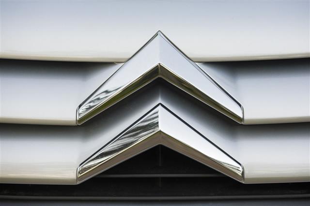
The earliest known versions of the Citroën logo was a set of two white herringbones on a red background. The inverted chevron badge, that we know now, was designed by Landor Associates in 2009. The latest version is a three-dimensional pair of arrows and Citroën written in red on a white background.
André Citroën, the brand founder, was immensely fascinated by the profile of a helical gear engaged with a similar gear, that he came across at a milling unit. After getting a patent for the same, he set up a steel factory at St. Denis, France. With this, he started the mass manufacturing of double helical gears. It is noteworthy that these were also used on the Titanic. The profits that he earned, enabled him to venture into the automobile manufacturing arena.
The inverted chevron badge on the logo represents the double helical gears in contact, which is also a subtle reminder ― as the French say Créative Technologie―to all the other manufacturers that they have been using the same Citroën technology.
BUGATTI
Ettore Arco Isidoro Bugatti, founder of “Bugatti”, was the son of a jewelry designer. He demonstrated great cognition of the different aspects of automobile manufacturing which got interpreted in the exquisite ways the cars were manufactured. Each car from Bugatti is a masterpiece of art; right from precisely engineered engine blocks to the primly-knit wiring in the car.
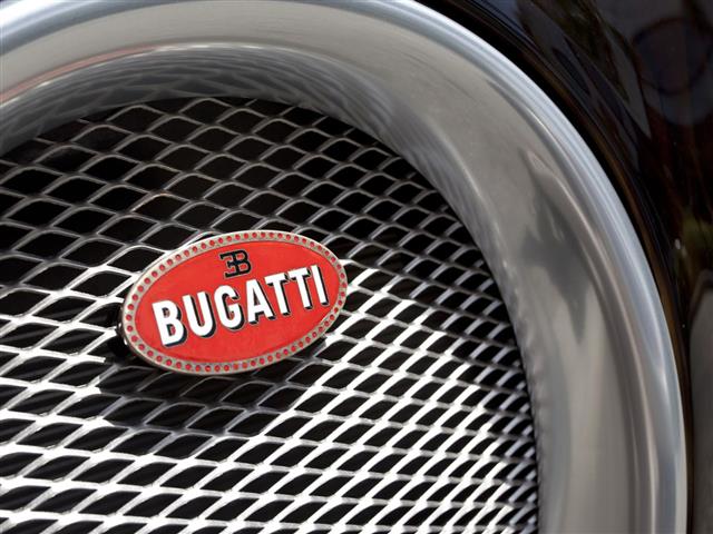
The logo was embedded with jewels― 60 red pearls outlining the initials of Ettore Bugatti and the standard white Bugatti on a red and black background. It was not just a corporate logo but a clear message that cars produced by Bugatti surpassed all conventions and was a step ahead in automobile design with a combination of technology and elegance― “Le Pur Sang Des Automobiles”, in every sense.
PEUGEOT
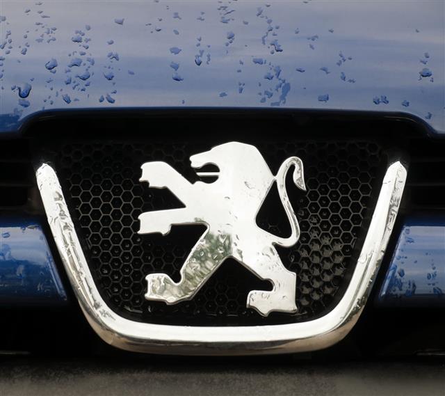
The Peugeot lion, derived from the Région Franche-Comte flag, was officially created as the corporate logo by Justin Blazer in the year 1847. Interestingly, Jean-Piérre and Jean-Frédéric Peugeot had initiated this major French brand way before, in 1812. The company, however, remained a steel mill, producing articles for household and industrial purposes until 1855. The company then entered into bicycle production and went on to become the largest bicycle manufacturer in France.
The logo appeared on Peugeot cars when the family moved into the automobile business. Modifying it over time, the latest in 2010, the company unveiled the customized logo to emphasize the power and fine calibration that Peugeot possessed. The Peugeot in blue represents the company’s vision into a stylish tomorrow with Motion & Emotion being the brand signature.
RENAULT
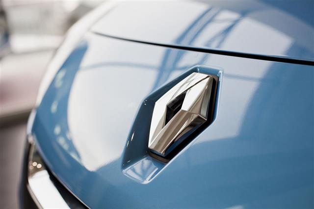
The Renault trio―Louis, Ferdinand, and Marcel―had their initials featured in the earliest logo designed in 1900. Eventually, by 1906, it changed to a car encircled in a gear-shaped logo. Later, after World War II, when it started producing light tanks for the Allies, it changed its logo again to an FT tank. The well-known “diamond badge” came into existence during 1925, while the most recent three-dimensional design was designed by Victor Vasarely in the year 1972.
The latest modified version has the yellow diamond badge with the name Renault in black font placed right beneath it. The company logo stands for the quality of cars produced by Renault. Renault has also changed gears and traveled into a new lane―production of electric cars. Renault has accelerated their new plan “Drive The Change” with realistic targets that is set to be achieved by 2017.
A truly enthralling history of the French logos with each one wanting to stand out in the wide and ever changing world of automobiles. Hope you enjoyed your drive. Au Revoir!


